Pioneer Design System
Building a Scalable Enterprise Level Design System
I took the lead in the creation and management of a robust design system and style guide for a responsive enterprise-level inventory management platform. This system established a foundation of consistency, accessibility, and efficiency, creating a consistent user experience between workflows while effectively enabling cross-functional collaboration and consistency across teams.
My Role
Design Systems Creation and Management
Services
UI & UX Design Design System Governance
Focus
Design System Creation/ Implementation
Date
January 2023 - Current

The Challenge
Solutions
Design and implement a unified design system to serve as a reference and resource for a responsive Inventory Management product.
Creation of UX/UI Design System
Full Figma component library for web and mobile
Comprehensive Style Guides for all styles and components
Design System Governance and Maintenance
As the pioneer (pun intended) of the new Pioneer design system my role was to design and build the design system that would allow the rest of the team to build cohesively and concurrently. My responsibilities included:
Establishing foundational design principles and guidelines (atomic design).
Creating molecular level components and accompanying style guides to ensure scalability and reusability.
Design system governance, updating the design system, and ensuring its consistency and compliance.
1. Defining the Atomic Foundation
Creating the design system began with defining the basics at the atomic level.
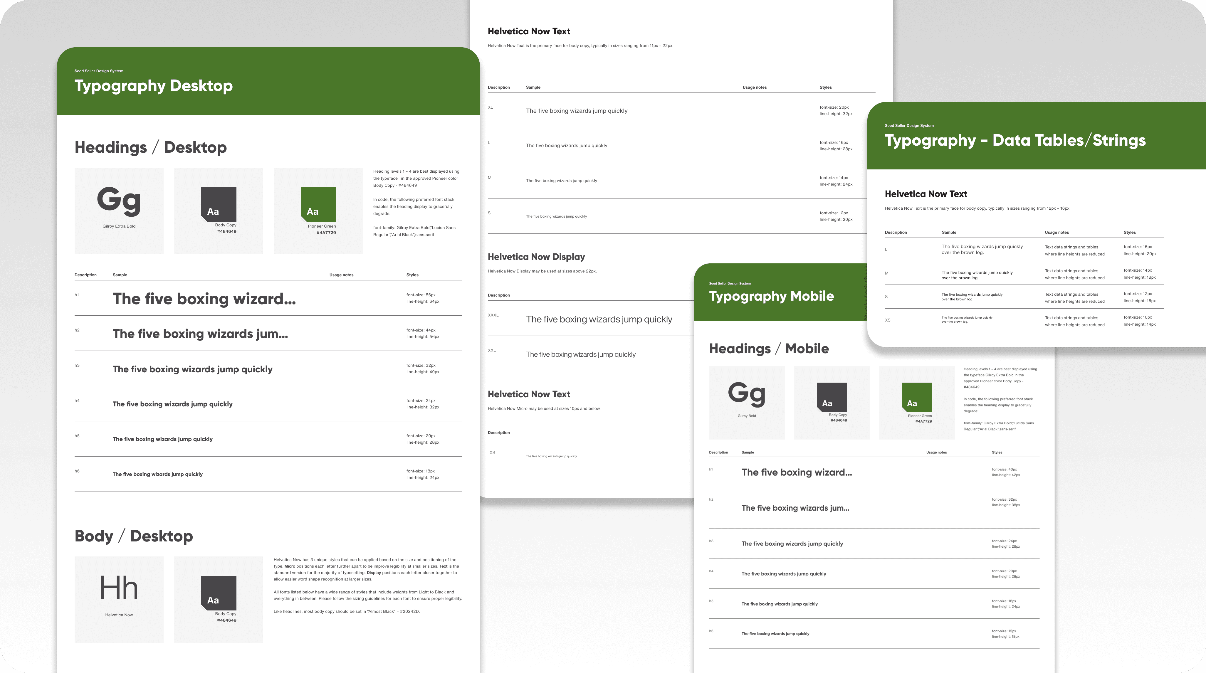
Typography: The typefaces, pixel height, line heights, weights, and colors for the full size run of heading and body copy sizes (H1-H6 and XXXL to XS).
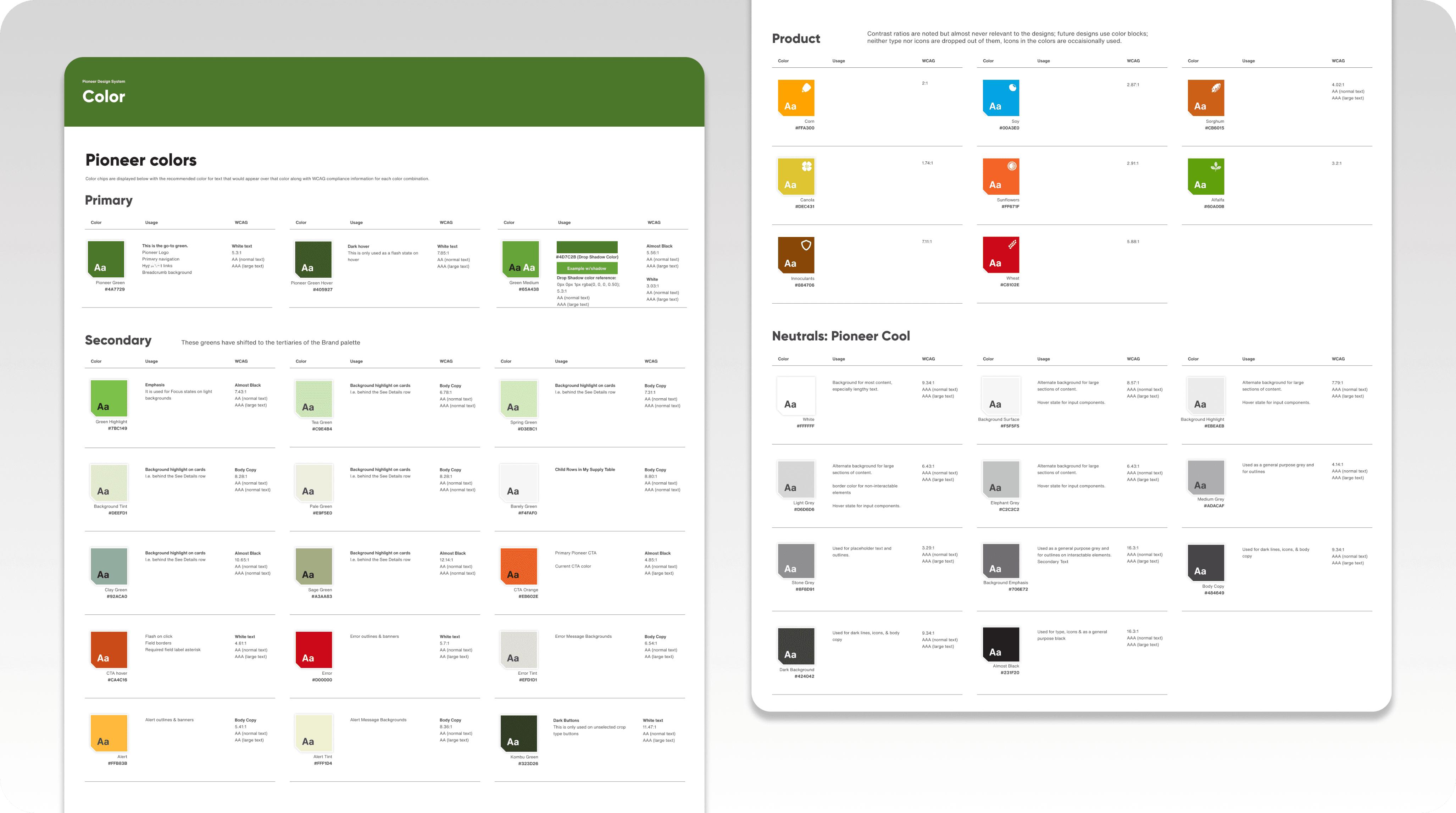
Color Palette: The primary, secondary, and tertiary color schemes as well as grey scale color values (100-900).
Grids and Spacing: Establishing guidelines ensured consistency across devices and other designers.
Accessibility: Ensuring AA Compliance, prioritizing items such as color contrast ratios, text sizing, and proper spacing between elements.
Creating Molecular Components
Building on the atomic foundation, I designed components that enabled all of the interaction needs for a functioning application:
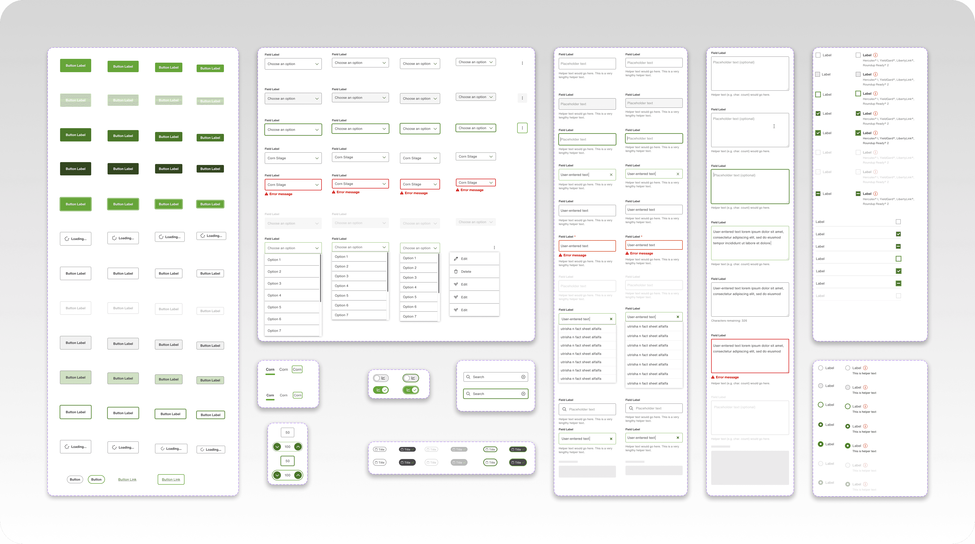
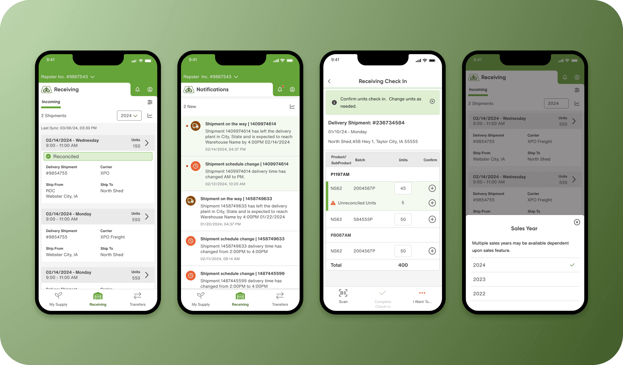
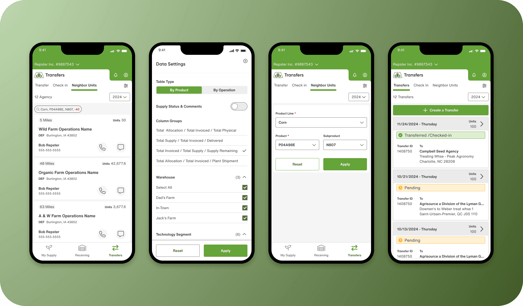
Interactive Elements: Buttons, toggles, controls, radio buttons, checkboxes, icons, and input fields were designed from the atomic elements in the initial stage.
Navigation: Menus, top level navigation for web and mobile, notifications, modals, and future states for scalability.
Data Display: Modular table components, list and card elements, filter panels .
3. Interaction Patterns and Usability
One unique challenge to this project was creating a brand new product and design system concurrently. Establishing interaction patterns early on was necessary in order to ensure consistency with the greater design team. Key considerations included:
Prioritizing readable typography size standards for all display types.
Creating workflows that established patterns for interactive elements like modals, overlays, and accordions ensured consistency across features on web, tablet, and mobile.

4. Defining Style Guides
I established comprehensive style guides for the design system, providing clear documentation and precise definitions of intended use cases. Each component was showcased with contextual examples, and CSS styling which allowed for easier implementation for both design and development.
The guides became an essential resource for onboarding design and development teams, which enhanced efficiency and supported the growing design team.

Design System Governance
As the team expanded from 3 to 10 designers, I took a role in design system governance, developing the process for maintenance and updates to the design system. My responsibilities included:
Maintaining Brand and Design Consistency: Reviewing new design work and change requests from the design team.
Promoting Patterns: Creating consistent patterns and interactions cases to fit the needs of the team and applying them to new work.
Reviewing proposed changes: Ensuring that new work adheres to the design system and reviewing updates with the design leads.
Documentation: Maintenance and upkeep of documentation for all changes and revisions.
Communication: Keeping the design, product, and development team informed of changes and advocating for the design system's value across departments.
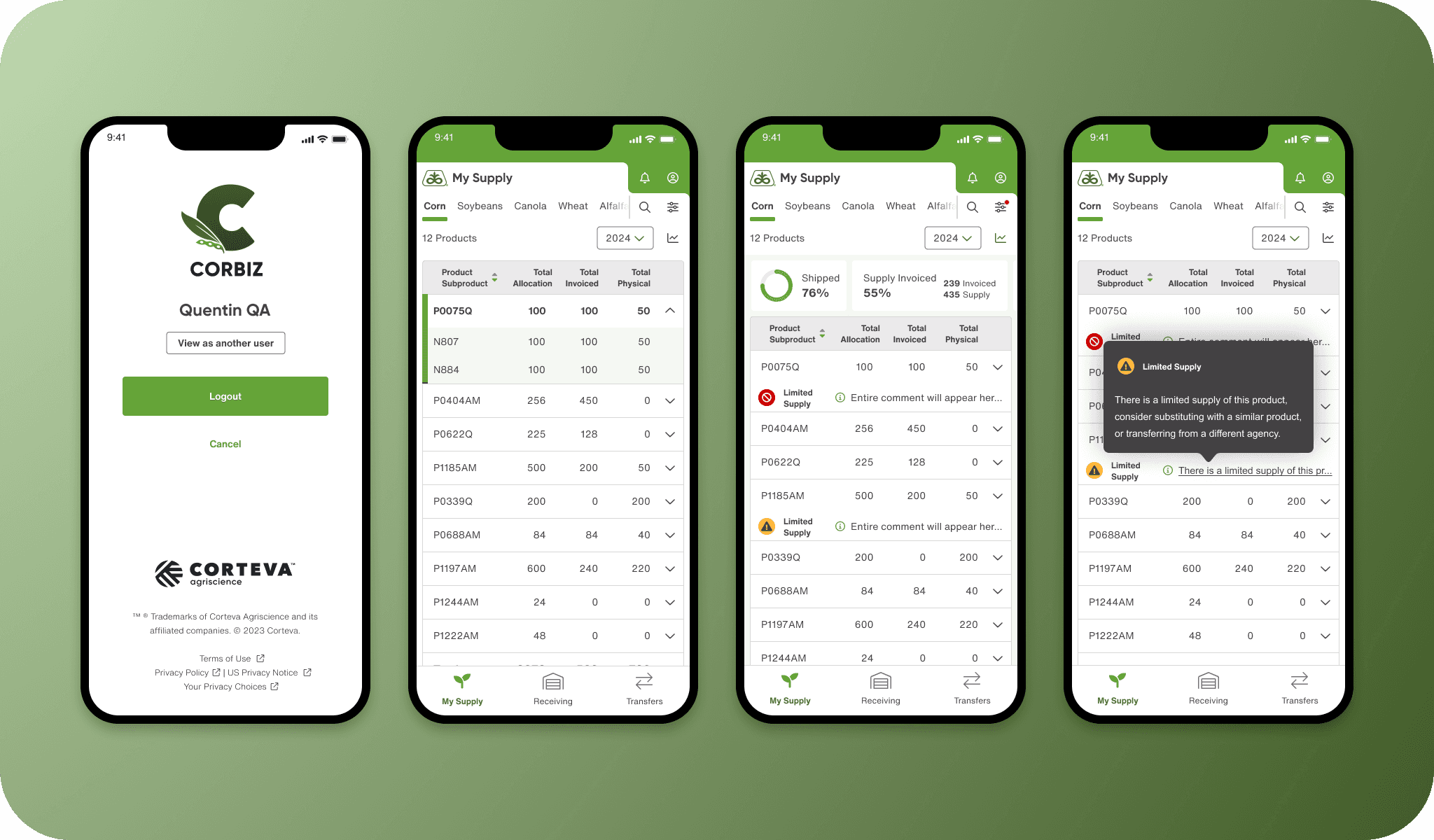
The screens below were all created with the Pioneer Design System.
The Impact
The design system significantly increased the design and development of new features for the team. With pre-approved assets and guidelines, developers could focus on implementation and feasibility allowing designers to prioritize user experience enhancements. This resulted in faster development cycles, imrproved efficeincy across teams, and strengthened brand identity.