Corteva Learning Management Software
Redesigning an Internal Education Tool
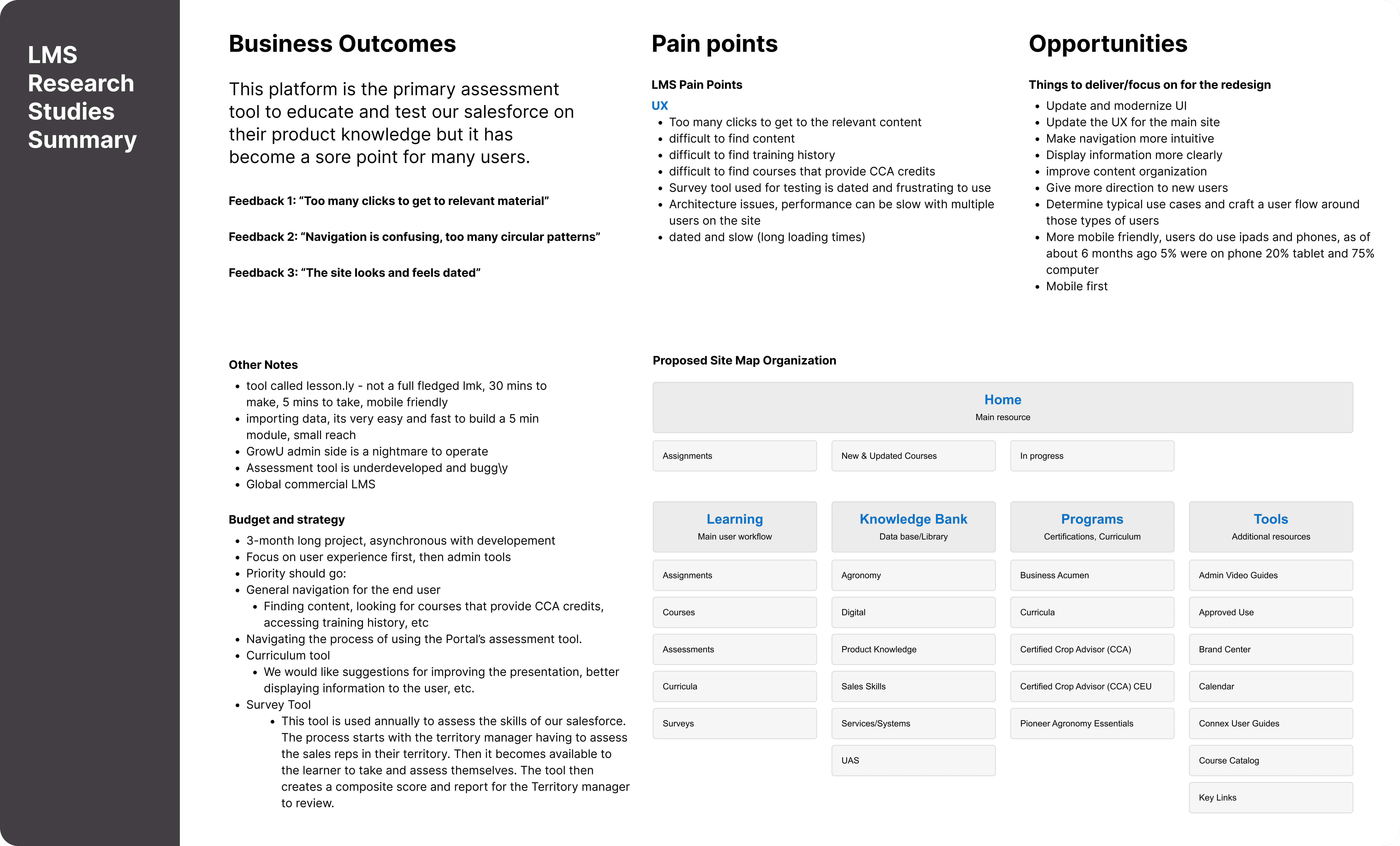
Corteva's Learning Management System had become a source of frustration for it's 22,000 employees, primarily due to a cluttered and unintuitive IA. My task was to identify the most common pain points and redesign several of the existing workflows to create a more user-friendly design.
My Role
Product Designer/ UX Researcher
Services
UI & UX Design UX Research
Focus
Responsive Web & Mobile
Date
March - June 2023

The Challenge
Solutions
Redesign the existing learning management system to reduce cognitive load on users reinforce brand identity. Many users had voiced concerns and frustrations to the point that it was taking away from the administrators ability to manage the incoming support requests.
User Research, UX Design + Strategy
Update UI and Brand Recognition
Mobile and Web Design + Development
The existing learning management system was cluttered and confusing. Poor information architecture made it difficult for instructors and students to find essential resources, and left users feeling directionless. These issues led to frustration, low user engagement, and an inordinate amount of support requests. The client wanted a solution that streamlined navigation, improved usability, and aligned with their vision for scalable growth.


My Role:
As the lead designer and researcher for this 3-month project, I began working by getting a better understanding of the problems that users were experiencing. Poor information architecture made it difficult for instructors and students to find essential resources, and left users feeling directionless. The system admins also cited feedback that the system was difficult to navigate and had an outdated UI.
Main Objectives:
Update, Modernize, and Standardize UI/UX patterns
Reorganize IA and clarify the navigation structure
Redesign the most common user flows to reduce friction with users
Getting Started
I began by reviewing observations of learners using the existing platform to better understand the most prevalent issues. Common themes included inconsistent navigation labels, difficulty finding resources, and an overwhelming number of options with lack of clear direction.
Research Insights:
Overlapping/circular navigation patterns resulted in redundant tasks and confused users.
Lack of visual feedback caused ambiguity on course progression/completion.
Many support tickets and emails were being created by frustrated users which led to lost time for administrators.
Design Process
I transitioned from research to design by creating wireframes and lite prototypes to test smaller interactions with stakeholders and administrators. This method yielded several benefits:
Addressing Blind Spots Early:
Regular stakeholder reviews ensured that no critical needs were overlooked, especially for administrators. Close collaboration revealed unique requirements to the curriculum programs and survey tool that proved critical for the pilot launch.
Rapid Prototyping:
I developed several prototypes to test initial concepts early in the project cycle. By focusing on clear IA and highlighting visual interest I was able to get more insightful feedback on my ideas before finalizing solutions.
Visual Simplicity:
I opted to reduce the number of on-page actions to reinforce the most common use case workflows. Simplification led to better cognition and less mental burden when searching for a specific lesson, or completing courses in the curriculum.

Key Design Improvements
Given the time constraints, I prioritized working on making changes that would deliver the most value with less time investment. Some of these changes came in the form of:
Navigation Changes: A revamped left aligned menu replaces the previous multi-tiered drop down, with high-level pathways for various content types, such as assessments, lessons, and certification tests.
Updated Nomenclature and Copy: Clarifying naming conventions and descriptions lead to better usability and comprehension for users. Larger, clearer headings and sub headings also gave users a better sense of place and direction.
Streamlined Workflows: Improved task flows for core use cases, such completing assignments after lessons and tracking grades, minimizing unnecessary steps.

Testing and Validation
User Testing:
I tested the prototype with a group of representative users, including administrators and learners. Key findings included:
Users completed tasks significantly faster compared to the original design.
Navigation felt intuitive, with users consistently locating key features with ease.
Administrators appreciated the simplified workflows and clearer structure which made.
Iterative Refinements:
Based on feedback, I made adjustments to the designs by enhancing the visibility of course titles and thumbnail images, and creating modular responsive designs for the course cards.


The Impact
By redesigning the learning management system I addressed critical user pain points around navigation and accessibility, resulting in a solution that was intuitive, user-centered, and scalable. Through a research-driven approach I was able to increase the rate of task completion for learners, and demonstrate the value UX Design to the system administrators.